
40 Inspiring Color Harmony Interior Design Ideas for Balanced Spaces
Looking to create balanced spaces? Embrace monochromatic magic with varied shades that add depth. Experiment with complementary color combinations for vibrancy or choose analogous colors for a soothing effect. Earthy tones bring warmth, while pastel palettes foster a serene ambiance. Don’t forget textured wall treatments and colorful accessories for small spaces! You can also mix neutral bases with bold pops or combine different shades of the same color for a harmonious feel. Discover even more inspiration waiting for you.
Complementary Color Combinations

To create a vibrant and balanced space, consider using complementary color combinations in your interior design. According to color theory, these colors sit opposite each other on the color wheel, such as blue and orange or red and green.
This contrast not only energizes a room but also creates visual interest. Understanding color psychology helps you choose combinations that evoke the desired emotions; for instance, pairing a calming blue with a lively orange can inspire creativity while maintaining tranquility.
Analogous Color Schemes

Creating a soothing and cohesive interior can be effortlessly achieved with analogous color schemes, where colors that sit next to each other on the color wheel are combined.
This approach not only enhances visual appeal but also taps into color psychology, promoting a sense of harmony and balance.
You can experiment with shades of blue, green, and teal for a calming effect, or opt for warm reds, oranges, and yellows to energize your space.
Pastel Palette for Soft Ambiance

A pastel palette can work wonders in crafting a soft ambiance that feels both fresh and inviting. By choosing pastel paint for your walls, you create a serene backdrop that complements any decor.
Soft hues like mint green, blush pink, and baby blue bring a lightness to your space. To enhance the effect, incorporate pastel textiles such as cushions, throws, and curtains. They add texture and warmth while maintaining that gentle vibe.
Mix and match these elements to create a cohesive look that encourages relaxation. With a pastel palette, you’ll transform your home into a peaceful retreat that feels inviting and harmonious.
Bold Primary Colors for Playful Vibes
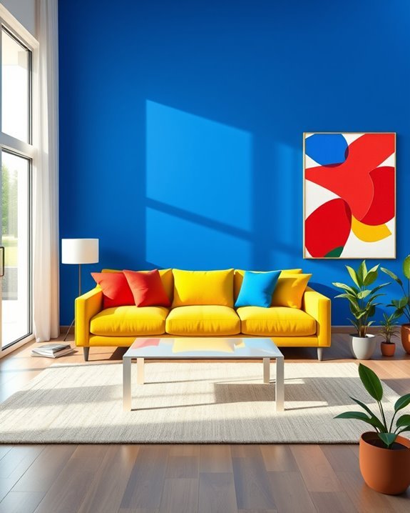
When you want to infuse your space with energy and vibrancy, bold primary colors can do the trick. These colors—red, blue, and yellow—tap into bold color psychology, creating an atmosphere of excitement and creativity.
To embrace playful design elements, consider mixing and matching these hues through furniture, artwork, or accent walls. A bright red sofa paired with blue cushions can instantly uplift your room.
Don’t shy away from patterns or textures; they enhance the playful vibe. By incorporating bold primary colors, you’ll transform your space into a lively haven that sparks joy and inspires creativity.
Cool Blues for Tranquil Retreats

To transform your space into a tranquil retreat, incorporating cool blues can work wonders. Oceanic hues create serene spaces that invite relaxation and calm.
By using calming palettes of invigorating blues and soothing shades, you’ll achieve peaceful vibes that enhance your home’s atmosphere. Consider painting walls in soft aquas or deep navy to establish tranquil tones.
Complement these colors with white accents and natural textures for a balanced look. Add pillows or throws in various shades of blue to tie everything together, ensuring your restful retreats feel inviting and serene.
Embrace these colors for a rejuvenating experience in your everyday life.
Jewel Tones for Luxurious Touch

After establishing a tranquil retreat with cool blues, you might want to explore the richness of jewel tones for a more luxurious touch.
Incorporating jewel tone fabrics like emerald greens, sapphire blues, and deep purples can instantly elevate your space. Consider plush velvet cushions or drapes that catch the light beautifully.
Add jewel tone accents through decorative items such as throw pillows or artwork to create a striking contrast. These bold hues not only bring warmth and sophistication but also invite a sense of opulence that transforms your interiors into a lavish sanctuary.
Embrace jewel tones for an unforgettable ambiance.
Vibrant Accent Walls

If you’re looking to bring a burst of energy into your space, vibrant accent walls can do just that. By choosing bold shades from vibrant color palettes, you can create a focal point that energizes your room.
Experiment with various accent wall techniques, like geometric patterns or ombre effects, to add depth and visual interest. Pair your accent wall with complementary colors in your decor for a harmonious look.
Whether it’s a lively red or a playful turquoise, a vibrant accent wall can transform your space, making it feel inviting and dynamic. Don’t hesitate; let your walls reflect your personality!
Color Blocking Techniques

While many design styles favor subtlety, color blocking techniques embrace boldness and vibrancy, allowing you to transform your space into a dynamic canvas.
By using bold contrasts, you create a striking visual impact that enhances spatial perception. Experiment with color psychology to evoke specific emotions and moods, making your environment truly personal.
Dynamic arrangements of colors can lead to artistic expression, showcasing your unique style. Don’t shy away from creative layering; it adds depth and interest while maintaining aesthetic balance.
With careful design experimentation, your space can become a vibrant reflection of your personality through the art of color blocking.
Layering Textures With Color

Three essential elements can elevate your interior design: color, texture, and layering.
By combining textured fabrics with mixed materials, you create tactile surfaces that invite touch and enhance sensory experiences. Use color psychology to select hues that evoke feelings of warmth and comfort, while layering patterns can add visual interest.
Aim for texture balance by incorporating contrasting textures—think soft cushions against a sleek leather sofa. Experiment with fabric combinations to introduce depth perception in your space.
Interior layering not only enriches your design but also makes your environment feel more inviting and harmonious, encouraging a deeper connection with your home.
Two-Tone Walls for Depth

To create a striking visual impact in your space, consider using two-tone walls that add depth and dimension.
By combining contrasting colors, you enhance the visual interest of any room, making it feel more dynamic. For instance, pairing a deep shade with a lighter hue can create a sense of contrast depth that draws the eye up or around the room.
You can also use two-tone walls to define areas, like separating a dining nook from a living space.
This technique not only beautifies your home but also offers a unique way to express your personality through color choices.
Bright Yellow for Cheerful Spaces
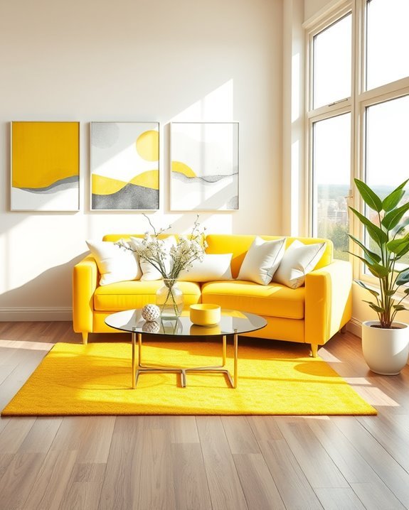
Bright yellow can instantly uplift your space and create an inviting atmosphere, making it a perfect choice for cheerful interiors.
This sunshine yellow hue evokes feelings of joy and positivity, transforming any room into a lively sanctuary. You can use bright yellow as a primary color for walls or as vibrant accents through furnishings and accessories.
Consider adding cheerful throw pillows, artwork, or a statement rug to enhance the overall vibe. Pair it with complementary shades like soft grey or crisp white to maintain balance.
With these touches, you’ll enjoy a bright, uplifting environment that inspires happiness every day.
Rich Burgundy for Warmth

While exploring ways to create a cozy atmosphere, rich burgundy emerges as a stunning choice for adding warmth to your interiors. This deep hue instantly envelops a space in comfort, making it perfect for living rooms or bedrooms.
You can incorporate burgundy accents through throw pillows, curtains, or an accent chair, enhancing the richness of your decor. Pair these accents with rich textiles like velvet or wool to elevate the tactile experience.
This combination not only adds visual depth but also invites a sense of relaxation, transforming your home into a warm haven where you can unwind and enjoy life.
Aqua and Coral for Coastal Vibes

When you want to infuse your space with a revitalizing coastal vibe, combining aqua and coral can create a vibrant and inviting atmosphere.
Start by adding aqua accents, like throw pillows or artwork, to bring a rejuvenating touch reminiscent of ocean waves. Pair these with coral decor elements, such as vases or wall art, to evoke the warmth of a sunset.
You can also consider a coral area rug against a light aqua wall to tie the look together. This color harmony not only enhances your space but also brings a joyful spirit that captures the essence of coastal living.
Monochrome With a Twist

Monochrome doesn’t have to be boring; in fact, it can be a striking foundation for a sophisticated interior design. By choosing a single color, you create a cohesive look while adding interest through textured layers.
For instance, pair sleek black furniture with soft gray throws and a plush white rug. To elevate the space, incorporate monochrome accessories, like patterned cushions or art pieces, that add depth without overwhelming the palette.
This approach allows you to play with shades and textures, creating a dynamic environment that feels both modern and inviting. Embrace the elegance of monochrome with a twist!
Pastel Accents in Modern Design

Pastel accents bring a rejuvenating softness to modern design, effortlessly bridging the gap between bold statements and subtle elegance.
You can incorporate these soothing hues in various ways, like transforming your pastel kitchen into a serene culinary space. Soft mint greens or blush pinks can create a calming atmosphere, making cooking a joy.
Additionally, pastel textiles, such as throw pillows or curtains, can introduce gentle colors that harmonize beautifully with your existing decor.
These accents not only add visual interest but also invite warmth and comfort, ensuring your modern space feels welcoming and stylish.
Embrace pastels for a fresh, balanced aesthetic!
Layered Lighting and Color

In any interior design scheme, lighting plays an essential role in enhancing color and mood. By incorporating layered lighting, you can create depth and dimension, allowing colors to shine in different ways throughout the day.
Start with ambient lighting to establish a base and then add task and accent lights for versatility. Pay attention to color temperature too; warm tones create a cozy atmosphere, while cooler tones can energize a space.
Experiment with different sources—like floor lamps, sconces, and pendant lights—to achieve a harmonious balance that highlights your color palette beautifully. You’ll transform your space into a welcoming haven.
Seasonal Color Changes

As the seasons shift, your interior colors can reflect the changing moods and natural beauty of the outside world. Embrace seasonal palettes to create a harmonious environment that resonates with the time of year.
In spring, consider soft pastels and vibrant greens to evoke freshness, while summer might call for bright, lively hues.
As autumn arrives, warm, earthy tones can bring comfort, and in winter, rich jewel tones or cool neutrals can create a cozy atmosphere.
Neutral Bases With Bold Pops

When you choose neutral bases for your interior design, you create a versatile backdrop that allows bold pops of color to shine.
Neutral furniture, like beige sofas or gray chairs, provides a calming foundation, letting your personality come through with striking accents.
Consider vibrant cushions, colorful artwork, or eye-catching rugs to inject energy into your space.
These bold accents draw the eye and can transform a room without overwhelming it.
Combining Different Shades of the Same Color

By blending different shades of the same color, you can create a soothing yet visually interesting space that feels cohesive and well thought out.
Start with a dominant shade as your base, then introduce shades variation through accents and accessories. This approach not only adds color depth but also enhances the room’s overall harmony.
For instance, pairing light blue with navy can evoke calmness while maintaining visual intrigue.
Don’t shy away from experimenting; using multiple shades of one color can transform a dull area into a dynamic environment.
Embrace this technique, and watch your space come alive with effortless elegance.
Understanding the Basics of Color Theory
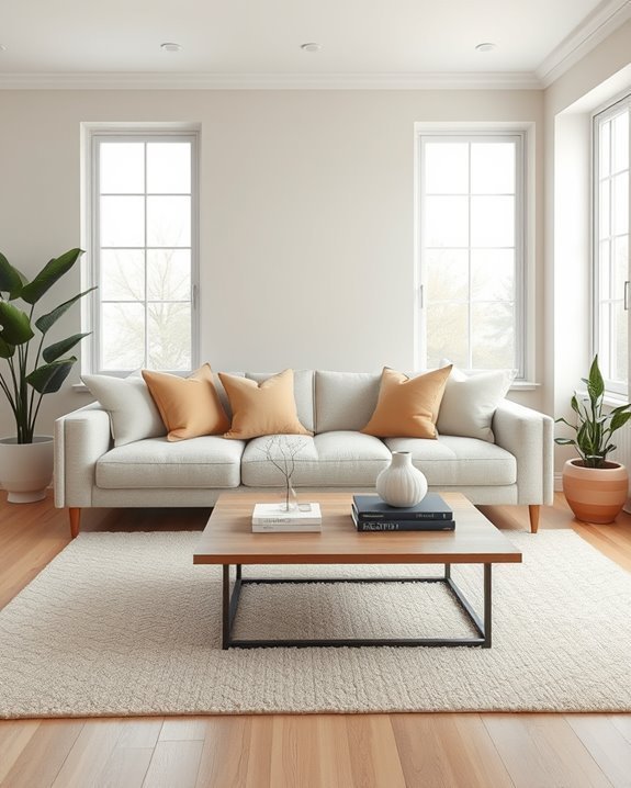
Color theory serves as the foundation for any successful interior design project.
Understanding color wheel basics is essential, as it helps you navigate the relationships between colors. Start with primary colors—red, blue, and yellow.
The Psychology of Color in Interior Design
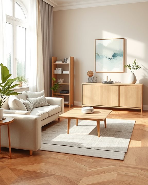
Understanding color relationships is just the beginning; the impact of color on mood and emotion plays an essential role in interior design.
Color emotions and associations vary widely, influenced by cultural significance and symbolism. The psychological impact of your choices shapes color perception, reflecting individual preferences and current color trends.
Choosing a Color Palette for Your Space

Selecting a cohesive color palette can transform your space into a sanctuary that reflects your personal style.
Start with color wheel basics to identify complementary and analogous colors. Use color selection tips like choosing a dominant hue, then incorporating accents and neutrals for balance.
This approach creates harmony, ensuring your room feels inviting and tailored to your taste. Embrace your creativity!
Monochromatic Color Schemes
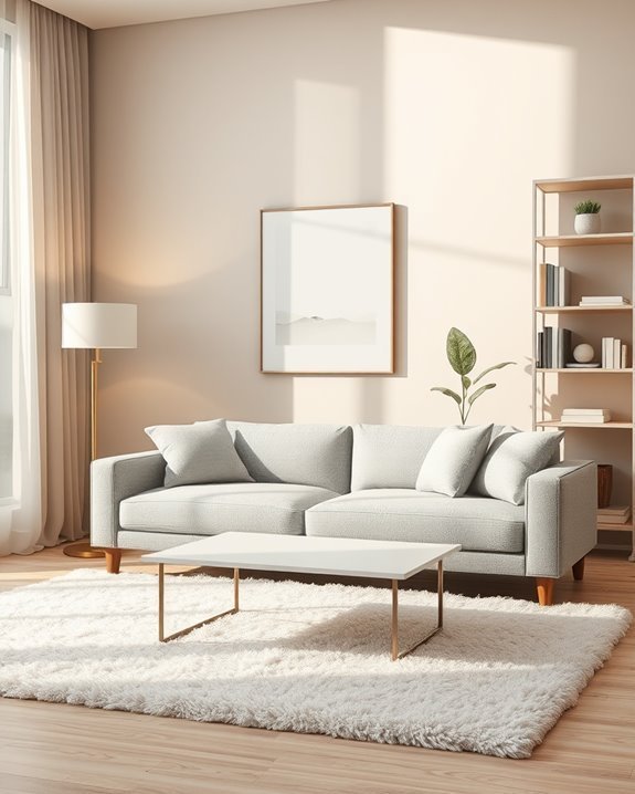
A monochromatic color scheme offers a sophisticated and cohesive look by utilizing variations of a single color.
By selecting a monochromatic palette, you can create depth through shades variations, enhancing the visual appeal.
Incorporate texture contrast to add interest, and consider lighting effects to highlight different tones.
This approach fosters a serene atmosphere while remaining stylish and inviting in your space.
Analogous Colors for a Harmonious Look
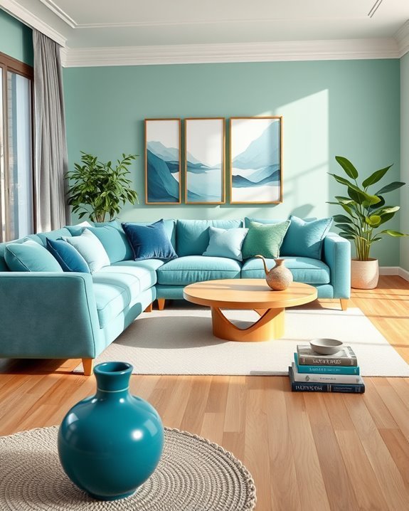
When you want to create a soothing and cohesive atmosphere in your home, consider using analogous colors.
By selecting colors next to each other on the color wheel, you can achieve beautiful color combinations through color blending and mixing.
Pay attention to color saturation and temperature for smooth color shifts.
Thoughtful color placement and accents will enhance the harmonious relationships in your space.
Triadic Color Combinations
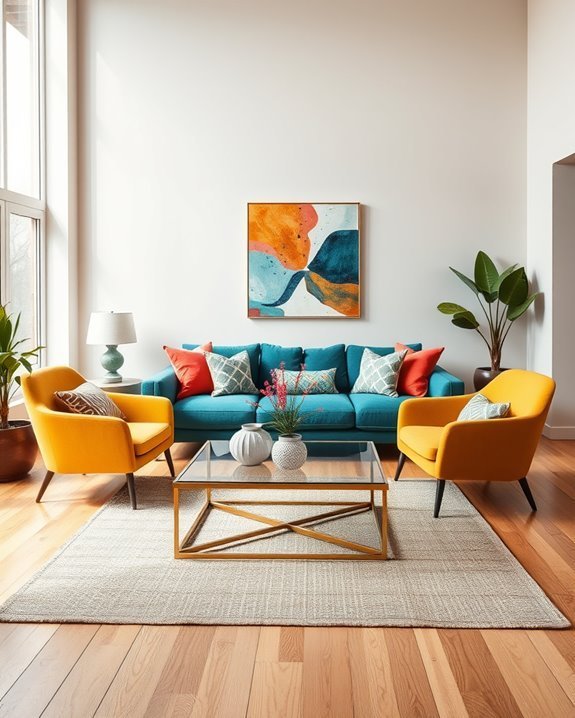
For those looking to inject vibrancy and energy into their spaces, triadic color combinations offer an exciting way to achieve balance and contrast.
By selecting colors from opposite points on the color wheel, you’ll create harmonious palettes and vibrant contrasts.
Utilize playful combinations for dynamic arrangements, ensuring each room showcases creative applications that enhance balanced aesthetics and invigorate your living environment.
Neutrals: The Foundation of Color Harmony
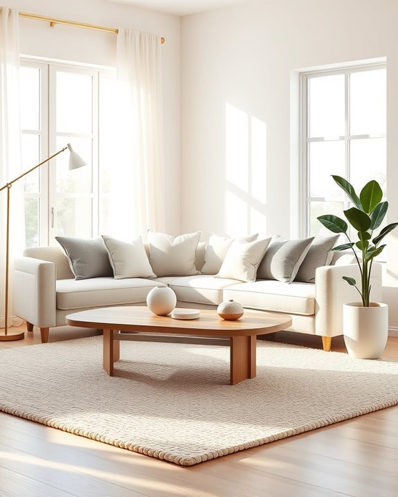
Neutrals serve as the backbone of any successful color scheme, providing balance and versatility to your interior design.
By using warm neutral tones and cool neutral shades, you can create timeless neutral palettes that resonate with neutral color psychology.
Layering neutrals effectively allows for unique neutral color combinations, while accenting with neutrals can enhance your space, creating warmth neutrally and inviting comfort.
Using Color to Define Spaces
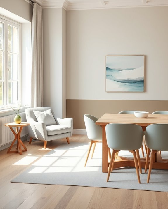
Color plays an essential role in defining spaces within your home, as it can evoke specific emotions and create distinct atmospheres.
By employing color zoning, you can achieve clear space definition and enhance area distinction. Use color boundaries to promote color separation between different areas, ensuring spatial clarity.
This thoughtful approach transforms your home, making each space feel unique and intentional.
Accent Walls: A Bold Color Statement
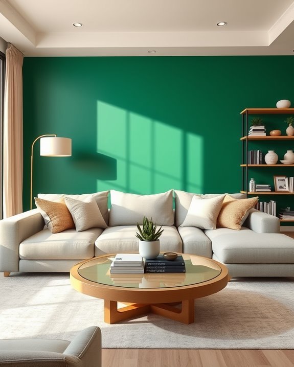
An accent wall can instantly transform a room, adding depth and personality to your space.
Explore accent wall techniques with bold color choices and statement wall inspiration. Use contrasting color effects to create visual focus areas, and consider wall texture options for added interest.
Experiment with color shifts methods and dynamic wall designs to make your accent wall a standout feature in your home.
The Role of Lighting in Color Perception
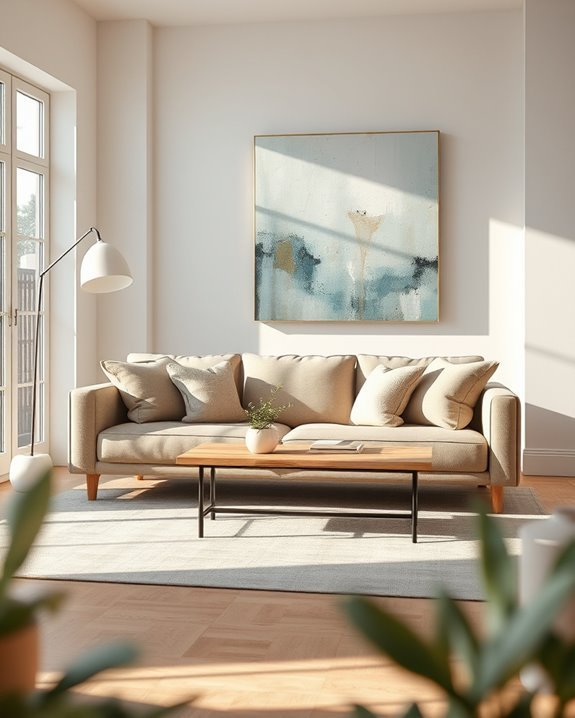
Accent walls can dramatically alter the ambiance of a room, but the effect isn’t solely about color choice.
Natural and artificial light play essential roles in how you perceive those colors. Warm tones may feel cozier under low light intensity, while cool tones pop with bright lighting fixtures.
Don’t forget about reflective surfaces, as they enhance color shadowing and overall ambiance creation.
Layering Textures for Depth and Interest
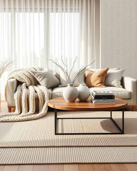
Incorporating three or more different textures in a room can elevate its visual appeal and create a sense of depth.
Use texture combinations like layered fabrics and fabric blends to achieve tactile contrasts.
Emphasize material variety for a rich sensory experience, ensuring textural balance.
This approach enhances surface dynamics and adds dimensional interest, making your space feel inviting and engaging.
Seasonal Color Trends for Interior Design
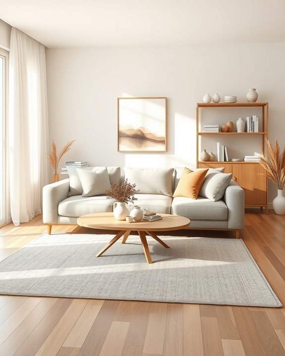
As the seasons change, so do the color palettes that inspire interior design, inviting you to refresh your spaces with hues that reflect the mood of each time of year.
Seasonal palettes evolve, offering vibrant tones in spring, warm neutrals in autumn, and cool shades in winter.
Keep an eye on color forecasting to stay ahead of trends and create a harmonious home throughout the year.
Color Blocking Techniques for Modern Spaces
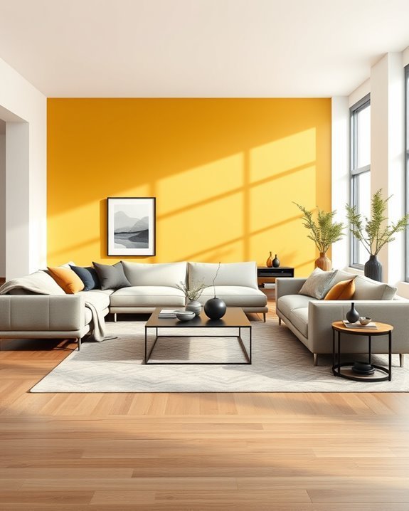
Color blocking can transform your modern spaces into vibrant showcases of personality and style.
By pairing bold colors in distinct sections, you create visual interest while maintaining modern aesthetics. Use contrasting hues for walls and furniture, or mix colorful accessories to enhance the effect.
This technique not only energizes your space but also allows you to express your unique taste effortlessly.
Incorporating Bold Colors Without Overwhelm
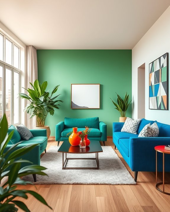
While bold colors can energize a room, it’s essential to incorporate them thoughtfully to avoid overwhelming your space.
Use bold color accents sparingly, mixing them with neutral tones to create balance.
Experiment with color mixing techniques, like pairing a vibrant hue with softer shades, to maintain harmony.
This way, you’ll enjoy the energy of bold colors without sacrificing comfort.
Pastel Palettes for Soft and Serene Environments
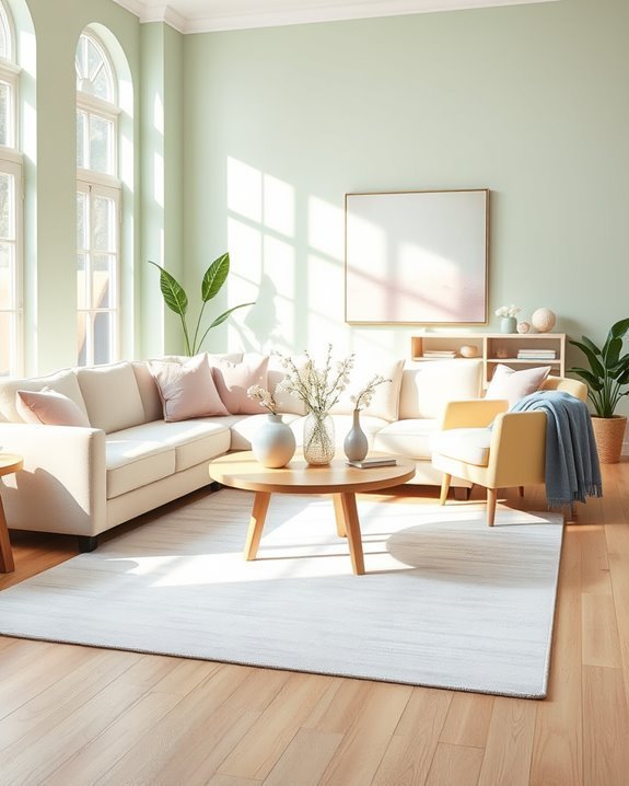
If you’re seeking to create a soft and serene environment, pastel palettes can be your best ally.
Choose pastel furniture to add a gentle touch, and complement it with soft decor like plush cushions or light curtains.
These calming hues will make your space feel inviting and tranquil, allowing you to unwind and enjoy a peaceful atmosphere every day.
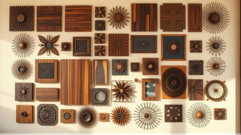
Earthy Tones for a Naturally Inviting Home
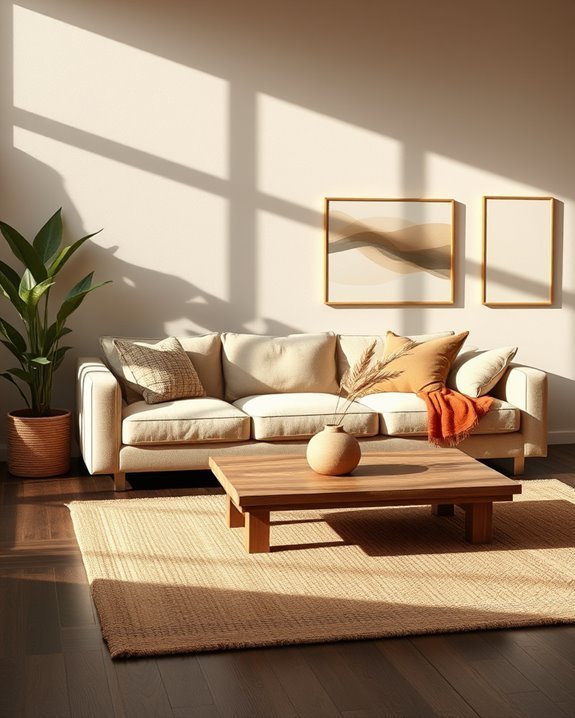
Embracing earthy tones can transform your home into a naturally inviting retreat.
Use warm textures like wood and woven fabrics to create a cozy atmosphere.
Incorporate earthy accents, such as terracotta pots or stone decor, to enhance the organic feel.
This palette promotes relaxation and connection to nature, making your space a perfect haven for unwinding after a long day.
Bright Colors for Playful and Energetic Spaces
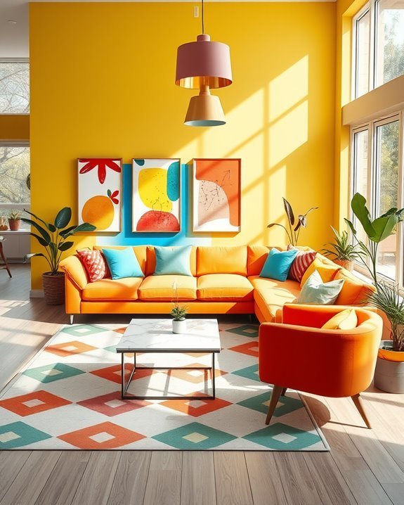
Bright colors can instantly lift the mood of any room, creating playful and energetic spaces that inspire creativity and joy.
You can incorporate vibrant accents through bold furniture or artwork, while playful patterns on rugs or curtains add an extra layer of fun.
Don’t shy away from mixing colors; a well-balanced approach will guarantee your space feels lively yet harmonious.
Using Color to Enhance Architectural Features
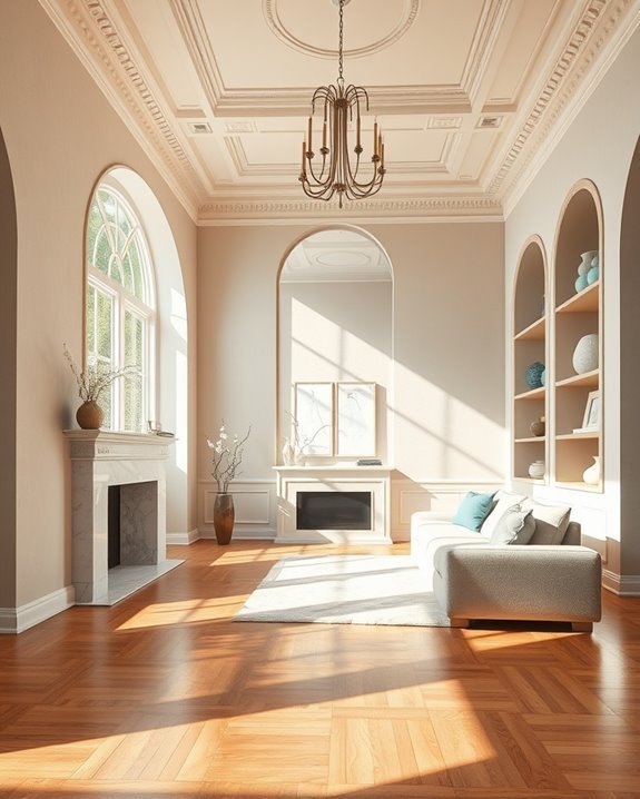
While architectural features can define a space, using color strategically can enhance their beauty and draw attention to their unique details.
Consider highlighting architectural contrasts by choosing colors that create depth and interest. Use lighter shades to emphasize structural lines, making them stand out.
This approach not only elevates your design but also creates a harmonious balance within the overall room aesthetic.
Harmonizing Colors With Furniture Selection
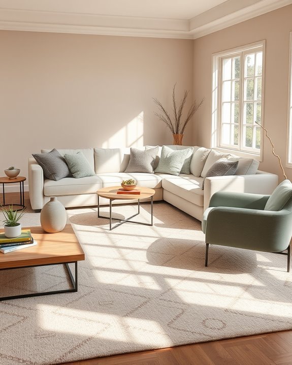
To create a cohesive look in your space, harmonizing colors with your furniture selection is essential.
Focus on furniture color matching to guarantee your pieces complement each other and the overall palette.
Remember that furniture material influence can also affect perception; warm woods may soften a bold color scheme, while sleek metals can add modernity.
Choose wisely for a balanced, inviting atmosphere.
The Importance of Color in Small Spaces
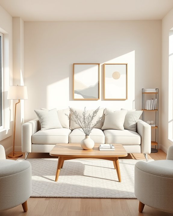
Color plays an essential role in small spaces, as it can dramatically influence how you perceive the dimensions and atmosphere of a room.
By employing effective color selection strategies, you can enhance small space optimization. Lighter shades can make a room feel larger, while cohesive color schemes create a sense of unity.
Thoughtful color choices can transform your compact areas into inviting retreats.
Using Color to Create a Focal Point
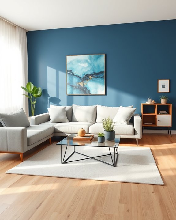
How can you draw attention to a specific area in your room? Use focal point techniques like color accentuation.
Choose a bold hue for an accent wall or statement piece, creating visual interest that guides the eye. Pair it with complementary shades in surrounding decor to enhance the effect.
This approach not only elevates your space but also emphasizes the focal area beautifully.
Artistic Approaches to Color in Decor

When you embrace artistic approaches to color in decor, you’re not just adding hues to your space; you’re telling a story that reflects your personality and style.
Use color symbolism to evoke emotions and enhance your environment.
Let your artistic expression shine through bold color choices, playful combinations, and thoughtful contrasts, creating a balanced and harmonious atmosphere that captivates everyone who enters.
The Influence of Cultural Colors on Design
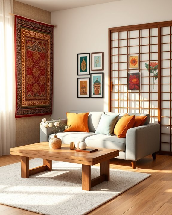
Understanding how cultural colors influence design can transform your space into a reflection of diverse traditions and meanings.
By incorporating cultural symbolism, you can create a unique atmosphere that resonates with your heritage or interests.
Consider blending a regional palette to evoke a sense of place, allowing colors to tell stories and foster connections, making your home feel more inviting and personally significant.
Balancing Patterns and Colors in Textiles
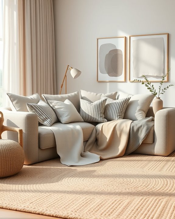
While you might feel tempted to fill your space with a variety of vibrant patterns and colors, achieving balance in textiles is essential for creating a cohesive look.
Focus on mixing textile patterns with varying pattern scales and fabric textures. Use contrasting designs intentionally and embrace textile layering to enhance visual balance.
This way, you’ll achieve pattern harmony that brings your space to life.
The Role of Color in Sustainable Design
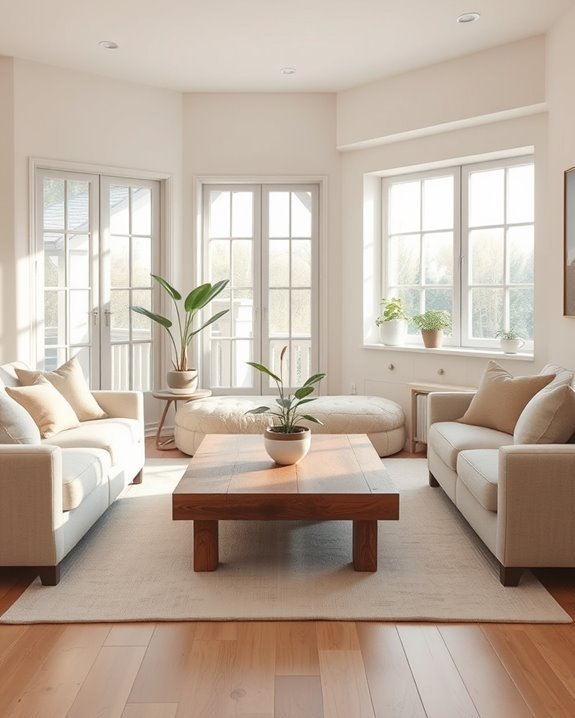
As you explore sustainable design, consider how color influences not only aesthetics but also environmental impact.
Choosing eco-friendly colors and sustainable materials can create a harmonious space. Incorporate biophilic design with nature-inspired palettes and energy-efficient hues.
Use recycled pigments to enhance minimalistic color schemes, while organic textures add depth, creating an environment that feels both inviting and environmentally conscious.
Experimenting With Color in DIY Projects
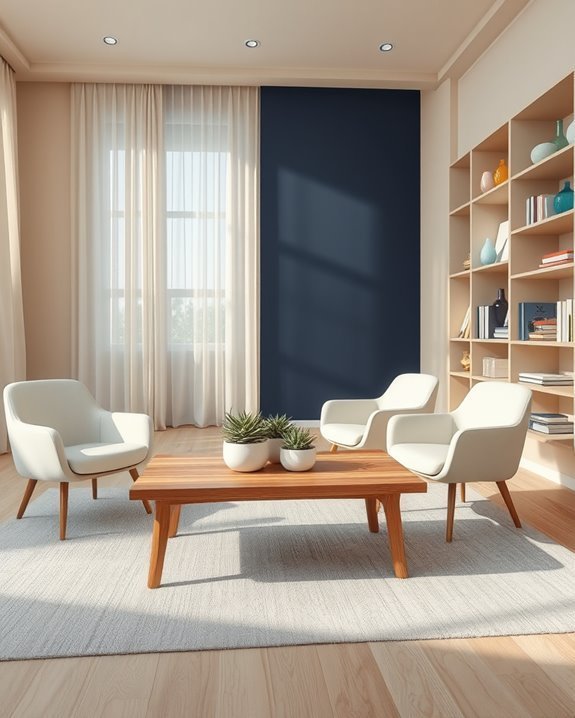
Color can transform your DIY projects into vibrant expressions of personal style.
By experimenting with color mixing, you can create unique shades that reflect your taste.
Try different DIY techniques like stenciling or ombre effects to add depth and interest.
Don’t shy away from bold choices; layering colors can bring your projects to life, making them truly one-of-a-kind.
Color Trends Inspired by Nature
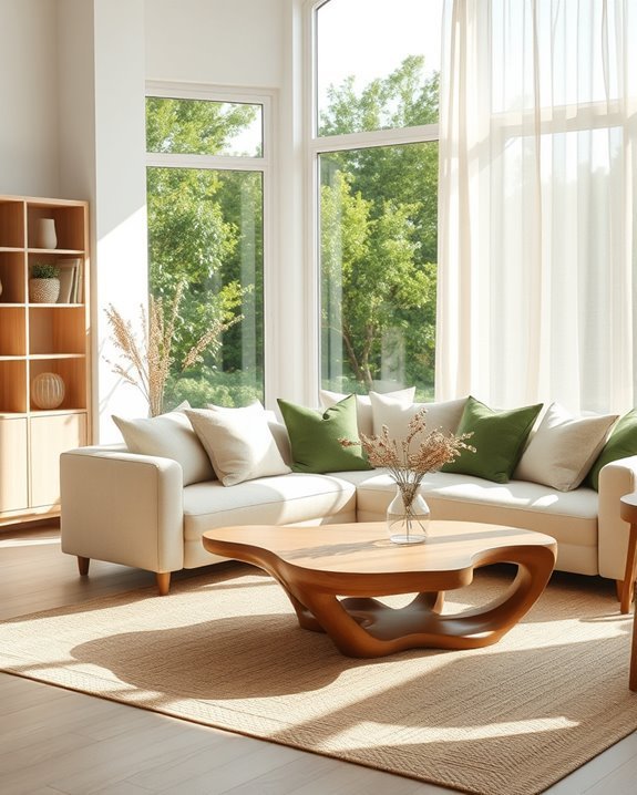
When you look to nature for inspiration, you’ll discover a rich palette that can transform your interior spaces.
Nature inspired palettes draw from seasonal color influences, offering a dynamic range of hues.
Imagine the warm tones of autumn leaves or the soft blues of spring skies.
Using Color to Create a Cozy Atmosphere
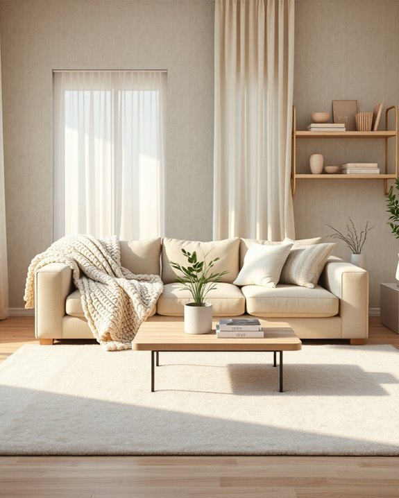
To evoke a cozy atmosphere in your home, consider the warmth of earthy tones and soft pastels.
Pair these colors with cozy textiles like plush throws and cushions to enhance comfort.
Don’t forget warm lighting; soft, ambient fixtures can make your space inviting.
Together, these elements create a harmonious balance, turning your room into a soothing retreat where you can relax and unwind.
The Evolution of Color in Interior Styles
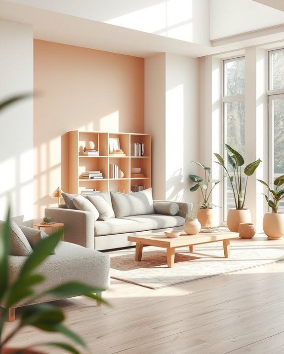
As you explore the evolution of color in interior design, you’ll notice how societal trends and technological advancements have shaped our choices over the decades.
Historical color shifts reflect cultural movements, while modern color influences often stem from global connectivity and sustainability.
Today, you can blend these elements to create harmonious spaces that resonate with both the past and the present, enhancing your home’s aesthetic.
Color Strategies for Home Offices
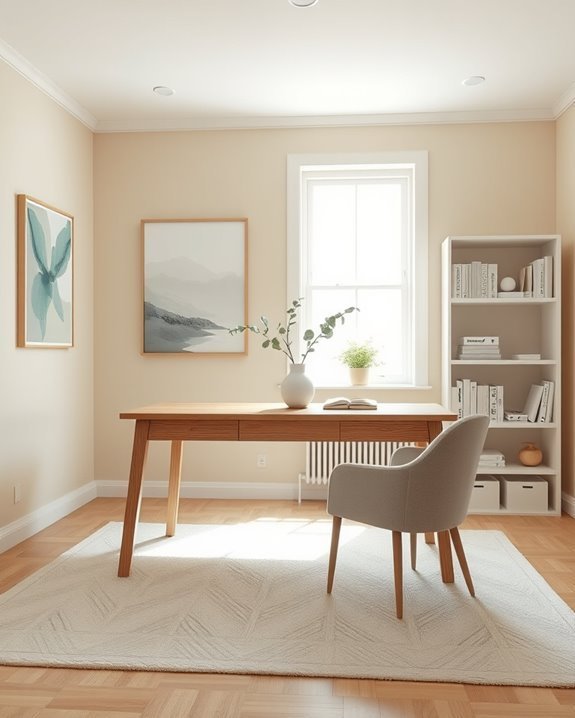
When designing a home office, choosing the right colors can greatly enhance your productivity and mood.
Opt for calming hues like soft blues or greens to create a serene environment. If you need a boost, energizing colors like yellow or orange can inspire creativity.
Balance is key—combine these shades with neutral tones to maintain focus and guarantee your space promotes ideal color productivity.
The Use of Color in Children’s Rooms
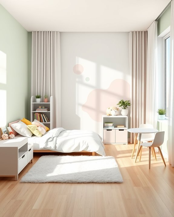
Creating a vibrant and imaginative space for children can be achieved through thoughtful color choices.
Use playful palettes to encourage creative expression and consider calming colors for relaxation.
Incorporate educational themes and interactive designs for sensory stimulation, while ensuring safety considerations are met.
Opt for gender neutral options that promote growth adaptability, allowing the room to evolve as your child grows.
Tips for Color Harmony in Outdoor Spaces
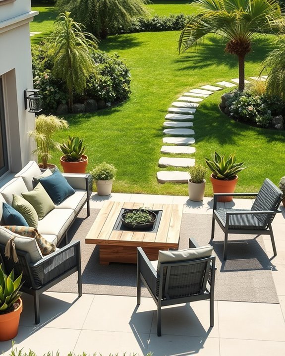
To achieve color harmony in outdoor spaces, consider how the surrounding environment influences your palette.
Choose garden color schemes that complement natural elements like flowers and foliage. Incorporate outdoor textiles in coordinating shades to tie your space together.
Think about the mood you want to create—soft pastels for tranquility or vibrant hues for energy—to guarantee a balanced and inviting outdoor area.
Conclusion
Incorporating color harmony into your home can transform your space and elevate your mood. By understanding color theory and the psychology behind it, you can choose palettes that reflect your personality and create balance. Whether you opt for a monochromatic scheme or complementary colors, remember to contemplate each room’s purpose. With these expert tips, you’re well on your way to designing inviting, harmonious spaces that resonate with you and enhance your everyday life. Enjoy the journey!